Thursday, May 31, 2012

Blog 5: Locovisual


Opened by the Governor General, Vascount Galway in June of 1937, the "gate-way" to Wellington, at least for commuters such as myself, the “Wellington Railway Station”. 

Both Neo-Classical, Victorian and rococo influences reside In the embodiment of Wellington Railway stations architecture, which has also been nationally recognized with the architectural significance due to the design and development by Gray Young, Morton and Young, and physical construction by Fletcher Construction.

"Much of New Zealand's architecture has been strongly influenced by overseas trends. In the mid 19th century, British immigrants favored the building types they had left behind" (Swarbrick. N., ‘Creative life – Architecture’. Te Ara – the Encyclopedia of New Zealand.). "Wellington Railway(train) Station" shows emphasis on this quotation, as it has it has strong links to the Neo-Classical architectural style.


The station portrays similarities of that of the  "Parthenon" which can be described as "The baseline for Neo-Classical taste and the greatest piece of ancient architecture",(J. Petty, personal communication, March 14, 2012.). As we see in the images below and above, a light, creamy exterior, smooth stone texture upon its classical, Parthenon throne.


Though classicism is the baseline influence, stated in the introduction, the "Rococo"  and Victorian styles also evident. Within the mantle of the station abides a Victorian, almost Gothic revival style clock of which rococo trim occupies the outer curb.  The rococo style was the ignition that pushed the limitations and boundaries of classical design with organic, curvilinear forms as we see trimmed around the clock evidence of this by leafy organic accents and ridged texture.

Though there many examples of mixed architectural design residing around the streets of Wellington, the Railway Station remains to be one of Wellingtons prides, historically and architecturally. 


Cracken, H. (2008). Wellington Railway Station. New Zealand Historic Places Trust Pouhere Taonga

Retrieved from: 
http://www.historic.org.nz/TheRegister/RegisterSearch/RegisterResults.aspx?RID=1452&m=Advanced 

Jason,P. (2012) The continuing Curve: Baroque and Rococo design [ PowerPoint slides]
Retrieved from:
http://schoolofdesign.ac.nz/mod/folder/view.php?id=434.
Nancy, S. 'Creative life - Architecture', Te Ara - the Encyclopedia of New Zealand, updated 15-Jun-10.

Retrieved from:
 http://www.TeAra.govt.nz/en/creative-life/4 
Sarah, C. (1730-2008).Rococo: The continuing surve. New York, NY:Cooper-Hewitt Design Museum.

Wednesday, May 30, 2012

DSDN101 - Group Assignment Two - Written

We, (Chris,Emma and Clara) had the task of creating a company slogan to sell
sportswear and promote our brand name KASI. We had come together and
brainstorm ideas that would best suit our company, its the brand that we are
trying to sell.

As we are a sports merchandise company, the intention of our advertisement is
to 'sell' the idea that KASI caters to a wide variety of sports, people and
sportswear. Keeping this in mind, we needed to think of engaging and original
ideas that we thought would best draw our customers in.

Our aim was to keep the ideas pretty much the same as our first group project
to keep the consistency when it came down to making the 15second
advertisement. This involved keeping a theme of black and white and having
some kind of sports equipment as our main focus, so it was clear what exactly
it was we were trying to sell.

Our Sports Ware Merchandise Company KASI provides to all audiences and caters
to a variety of different sports. Our advertisement displays this
appropriately given the time we had to do it in and the amount of group time
we had together.


DSDN101 - Group Assignment Two - Video

Thursday, May 10, 2012

Blog 4: Curatorial


Aluminum, the third most abundant element, the most abundant metal, used in architectural context like planes, some of our cars. Used and perceived a strong metal, an architectural strength, reduced to nothing  but , a spiraling imitation of draining liquid though spiral forms, a liquefied element.
 "Growth is a spiral process, doubling back on itself, reassessing and regrouping." - Julia Margaret Cameron

Eddying spirals create fluid formality as a vortex of monochromatic aluminum gracefully flow throughout the object, surrounding , almost dominating but a sole strip of darkened wielding wire, which binds the spiraling vortex from falling asunder. "Growth is a spiral process, doubling back on itself, reassessing and regrouping." This emphasizes, the coil as it begins as one a singular entity, only  to stray from one another, not touching but simply hovering throughout while ignoring a simple wire which strives to match in shape and form, existing only to reassess and tame the unbound.

 
Fluid, the liquified Element
Weave
Fluidity is fabricated though spiraling curves. President image "The Liquefied Element"  was a  strong influence in the overall production of the model, the idea of turning fluidity into an element, line and curve constantly spiraling though out each other but never making contact, it's almost metallic, shiny surface encouraged me to use metal type materials, to capture light within the model


 "weave" influenced line. A line that gracefully passes though curvilinear forms changing path were it would otherwise touch and cause conflict between the two, the idea of an intellectual line, an intelligent form, awareness.


Quote received from: Brainyquotes, 2001. http://www.brainyquote.com/quotes/keywords/spiral.html. Bookrag Media Network

Artist unknown.(c. 2005)."Fluid, The Liquified Element."(Digital Art, Online Image), http://browse.deviantart.com/?qh=&section=&q=Fluid+The+Liquified+Element#/ddxpbd

Artist unknown.(c. 2011)."Weave."(Digital Art, Online Image),http://browse.deviantart.com/?qh=&section=&q=s0nova+weave#/d47fi9q


DSDN101 - Group Assignment One

Kasi Poster
Design Team: Clara da Haan, Emma Ngatai, Christopher Scott

Sunday, May 6, 2012

DSDN101 - One Word Film - Final Video - Vortex

Final Animation of Vortex, Added Sound and ending that didn't cause slowing down of video, or un-smoothing. Also fits animation.

DSDN101 - P2 - One Word Film, Draft 2 Video (without sound)

DSDN101 - P2 - One Word Film, Draft Videos(without sound)

A basic video of the intro for my Vortex animation, testing how smooth I can get the spiraling effect with various layers and motion tweens.

DSDN101 - P2 - One Word Film: Recorded Sound + Audacity


After being disappointed in the search for appropriate .wav files for my animation. I took the task of creating the sounds myself in audacity with my microphone. I had made 5-7 sounds that I tried to sync with my animation, in variations of "swhoosh, psssh, and keh" like sounds, to follow with the words as they spiraled around the middle.

DSDN101 - P2 - One Word Film: Vortex, Final, Selected Word


My final board for Vortex which is also the word I had selected to animate for my 10-50second film. I had changed the ending to swirl away rather than towards as I had trouble slowing the tween down without ruining the length of the film.11:27 PM11:27 PM

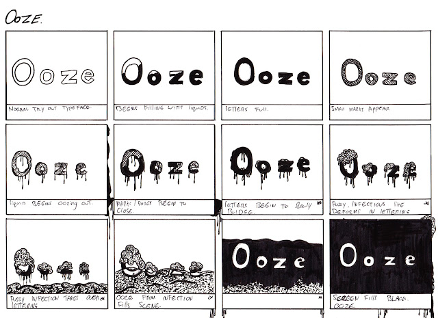
DSDN101 - P2 - One Word Film: Ooze Final Storyboard


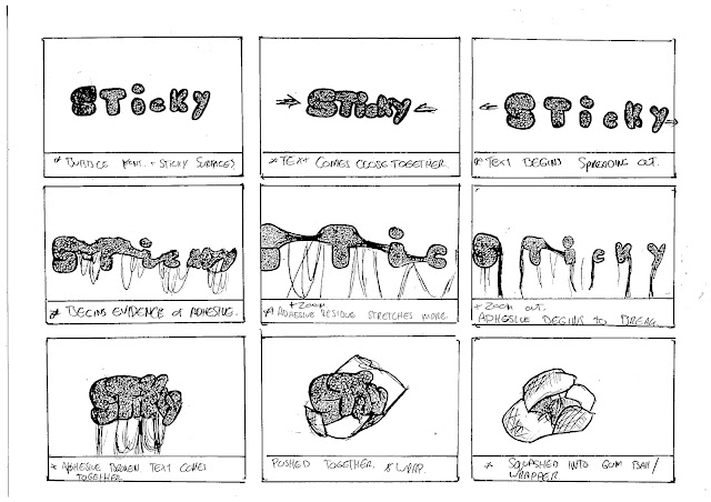
DSDN101 - P2 - One Word Film: Sticky, Final Storyboard


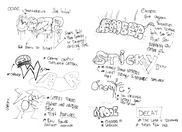
DSDN101 - P2 - One Word Film: Brainstorm, Initial Ideas


Draft idea for my word, "Vortex" the word breaks up into its letter form instead of word as they as sucked towards the center of the scene, think a vacuum of black hole, this process repeats itself, a few times till a mass of words form in the center,  eventually the word enlarges from the gathering mass and screen turns white, parts of the original word fly into the scene.


The initial idea behind ooze was to apply human like features to text, the idea of something non-human but more synthetic getting an infection of some sorts, inanimate objects becoming sick or catching a virus. The purpose of this was to give it a reason to ooze, so for example, a grazed knee gets infected, puss can ooze depending on how serious the infection can be, etc.


Bubblegum, was the thought behind this, the way when after being chewed, can stick to surfaces, or to additional lumps of gum. When you pull a gumball apart far enough, tiny stringy pieces of chewing gum begin to dangle and form the space created. Thus explaining the wrapper type form at the end, the gum spat back into the wrapper.

DSDN101 - P2 - One Word Film: Brainstorm, Initial Ideas


Rough ideas draw from generated and selected words.
 
Initial Ideas/Thought In Text.


Selected/Drawn:


Ooze: Extensive use of shape tweens and text with-in text to create texture, Essential idea is the word "Ooze" will gain pore like markings on the face of the text and being to "ooze" a liquid, think "a pussing infection" pores get clogged up from over-flow of slimy substance oozing from the text, causes inflammatory, thus ooze beings to drip more faster, faster thus filling the scene and Turing it black.

Implode: Pulsing text, enlarges, takes over all screen space, quickly gets sucked back in, to a smaller version of text, expands again, explodes inwards and vanishes. End scene, words lightly fly down from top of scene, particles left over?

Decay: Give the text an essence of life in time lapse, text grows old and begins to decay into a skeletal version of its former self, typeface swaps out.

Organic: Text starts in a seed like shape, begins to sprout into a word, thing circular, curved shapes, word appears along shapes.

Vortex: Text begins static on stage with the use of motion tweens, letters begin to follow each other off stage sweeping to one of the sides. Letters begin to spiral as if being drawn/sucked into the middle of the scene, at end process beings to reverse the last spiral and the word "vortex" gets spat back out of the vacuum.

Text Ideas:

Ember: Begin with wood/grain texture on text, text ignites, burning(shape tween for flame effect?) Text turns from white to black with black grain, pulsing from white to black to specify an ember effect, giving the text a glowing effect. This would be achieved with the use of frames on different layers, swapping symbols in and out of the scene.


War: Create a sense of conflict between the text, eventually text breaks out in fight, trying to gain area on scene(fighting over land? resources? etc..)


DSDN101 - P2 - One Word Film: Brainstorm, Initial Ideas


Eight Words I came up with for my brainstorm, Ooze, Ember, War, Sticky, Organic, Vortex, Implode and Decay. After doing a brain storm, I selected words that I had interest in and begin looking for appropriate typefaces to use within my animation. Typefaces were downloaded off "dafont.com"
As followed. Helvetica Light Std, Kaine, Matchbook Serif,  Matchbook, Pseduo, Futurist and Normal Tryout.